Master CSS Frameworks & Modern Styling
Comprehensive guides to Tailwind CSS, Bootstrap, CSS Grid, and Flexbox for developers in Malaysia
What You’ll Learn
From fundamentals to advanced techniques, we’ve got everything covered
Tailwind CSS Mastery
Utility-first CSS approach for rapid development. Learn configuration, responsive design, and custom components.
Bootstrap Framework
Industry-standard CSS framework with pre-built components. Master the 12-column grid system and responsive breakpoints.
CSS Grid Layout
Two-dimensional layout system for complex designs. Understand grid areas, tracks, and placement techniques.
Flexbox Fundamentals
One-dimensional layout method for alignment and distribution. Perfect for navigation, cards, and responsive components.
Responsive Design
Build sites that adapt to any screen size. Learn mobile-first approach and breakpoint strategies.
Advanced Styling
CSS variables, animations, and custom properties. Create maintainable and scalable stylesheets.
Get Started in 3 Steps
We’ve structured everything to take you from beginner to confident developer
Choose Your Framework
Start with Tailwind for rapid development or Bootstrap for established projects. Both have their strengths, and we’ll help you pick the right one for your goals.
Learn Layout Systems
Master CSS Grid for complex 2D layouts and Flexbox for flexible component design. Understanding both gives you complete control over your layouts.
Build Real Projects
Apply what you’ve learned by creating responsive websites. We provide code examples and best practices so you can build with confidence.
Popular Resources
Hand-picked guides to accelerate your CSS framework skills
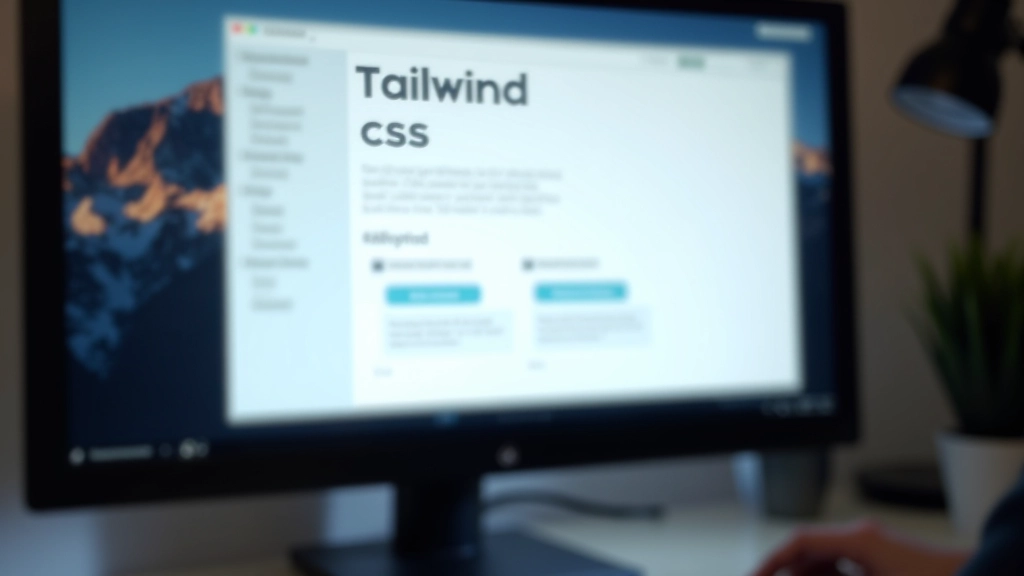
Getting Started with Tailwind CSS in Malaysia
Learn how to set up Tailwind CSS on your projects, customize configurations, and build responsive designs faster than traditional CSS approaches.
Read Guide
Bootstrap Grid System Explained Simply
Understand the 12-column Bootstrap grid, responsive breakpoints, and how to create flexible layouts that adapt to any screen size.
Read Guide
CSS Grid vs Flexbox — When to Use Each
Compare two-dimensional grid layouts with one-dimensional flexbox. Learn which layout method suits your design, with real-world examples.
Read GuideCommon Questions
Everything you need to know about CSS frameworks and modern styling
Should I learn Tailwind or Bootstrap?
It depends on your workflow. Tailwind’s utility-first approach is great for rapid development and customization. Bootstrap offers pre-built components that speed up prototyping. Many developers learn both to understand different philosophies and choose based on project needs.
When should I use CSS Grid instead of Flexbox?
Use Grid for two-dimensional layouts where you need control over both rows and columns. Flexbox excels at one-dimensional layouts like navigation bars and card grids. Many modern layouts combine both — Grid for page structure and Flexbox for component internals.
Are these frameworks still relevant in 2026?
Absolutely. Tailwind CSS keeps growing in popularity. Bootstrap remains industry standard for enterprise projects. CSS Grid and Flexbox are now fundamental CSS skills. These frameworks aren’t going anywhere — they’ve become essential knowledge for modern web development.
Can I use multiple frameworks together?
Yes, though it’s not always recommended. Many developers use Bootstrap for structure and customize with Tailwind utilities. Understanding how frameworks work lets you make smart decisions about combining them without creating conflicts or bloated CSS.
Why Developers Trust These Resources
Real content written by people who actually build websites
Real Code Examples
Every guide includes working code snippets you can copy and adapt. We don’t just explain concepts — we show exactly how to implement them.
Structured Learning
Progress from basics to advanced techniques. Each guide builds on previous knowledge, so you’ll develop genuine understanding rather than memorizing patterns.
Mobile-First Focus
We emphasize responsive design from the start. Learn to build sites that look great on every device, not just desktop screens.
Learn at Your Pace
No time limits or schedules. Study whenever you want, wherever you are. Jump between topics or focus deeply on one framework.
Frameworks We Cover
Comprehensive resources for the tools developers actually use
Tailwind CSS
Utility-first CSS framework for building custom designs without leaving your HTML
Bootstrap
Powerful, extensible, and feature-rich front-end toolkit with pre-built components
CSS Grid
Native CSS module for creating two-dimensional grid-based page layouts
Flexbox
CSS layout module for distributing space and aligning items in one dimension
Ready to Level Up Your CSS Skills?
Join thousands of developers who’ve mastered modern styling techniques. Get access to all our guides, examples, and best practices.
Start Learning Today